 monica
CREATIVE NOTES / Art & making
Pudding for three, jelly for four: Monica’s little dessert menu
Open A Little Dessert Book by Zhan Yining, known as Monica, and a practical question appears: what would you like to order? Juice, pudding, jelly and cakes sit beside handwritten prices. The shop is imaginary, but the menu takes its role seriously. Three photographs record its cover, open menu and back-cover collage.
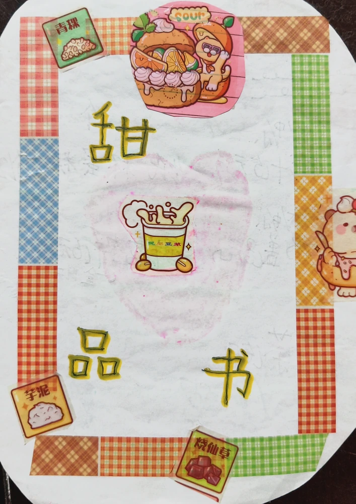
A checked border sets the mood
The cover is edged with checked strips in several colours, surrounding dessert images and the handwritten title. Orange, pink and green keep the border lively while leaving room in the centre for lettering and pictures. Rounded corners soften the shape of the booklet. Some images sit near the edge; others accompany the words. This first view does not tell us everything the shop offers. Instead, it establishes a mood and prepares the reader to open a small, playful version of a shop menu.
Prices give the numbers a purpose
Blue and pink lines divide the open menu into rows. Pudding is marked at three yuan and jelly at four; other entries, including juice and milk tea, also have prices. Numbers have a clear job because they accompany choices. A reader could turn this into a small imagined order: pudding plus jelly gives three plus four, or seven. That calculation follows the visible menu and remains an optional activity for the viewer. It does not imply that a real sale occurred or that this was Monica’s original classroom task.
A menu leaves room for a response
The right-hand page includes a house-special label and a place for evaluation, while a comment area also appears near the upper left. These spaces make the booklet more than a list of products: they suggest an exchange between someone presenting the menu and someone responding to it. Letter sizes vary, and stickers sit beside the writing. Preserving those details allows us to see the child’s arrangement of information, instead of replacing it with the uniform typography of a professionally printed restaurant menu.
The back cover turns flavour into pictures
The back cover carries more drinks, citrus shapes and character stickers. Orange and yellow details echo the cover, while smaller sweets and circular decorations sit between larger figures. After the written menu, pictures take over again. Looking at all three photographs gives the object a beginning, an interior to read and a final surface to explore. The work combines handwritten information with ready-made illustrations. Its interest lies in the way the booklet brings those different forms of communication into one small, coherent object.
Two more questions
Are these prices from an operating shop?
The source describes an imaginary dessert-shop menu. These are part of the craft, not a current commercial price list.
How do the three views fit together?
Read them as cover, handwritten menu and back-cover collage to follow both the information and the visual arrangement.
Explore the works in this note
Profile information was supplied by her family. These notes were prepared by the Monica portfolio editorial team from the original works, performance records and playable projects on this site, with AI-assisted writing and translation. Descriptions of existing work are distinguished from activities readers may try. The articles are editorial introductions, not first-person accounts written by Monica.
Profile and editorial notes →